Disclaimer
The contents are for communication only, the images included in this blog post are by no means to offend anyone. If you are the authors of some of the contents and are uncomfortable with the critique, I am open to academic discussion and happy to withdraw any of contents upon request.
Motivation
I have been conceiving this for a long time, mainly for helping myself understand and improving my own data visualization skills. Another purpose is to apply the rules offered in the Edward Tufte’s classic in the filed data visualization: The visual display of quantitative information in real practice. To practice my skills in separating good graphics from bad ones, I will first point out the potential issues with the visualization concerned, and then provide the possible alternative remedies. However, I could be wrong.
Symptoms of bad/ugly visualization
There are several typical types of bad or ugly data visualization, which can be categorized into the following:
- Used a wrong form of visualization for the data;
- Excessive decoration;
- Bad choice of color;
- Too much chart junk (elaborate).
Principles of a good visualization
Coming soon
Wrong form of visualization for the data
To be avoided
Pie chart.
First, let’s sort out what’s the bad with pie chart. Human eyes are neither good at distinguish the size of angles, nor good at matching quantitative value to two-dimensional space. Knaflic in her book stated that
Pie chart is evil.
Pie chart is simply too hard to read for people.
Never use 3D One of the golden rules of data visualization goes like this: never use 3D. Repeat after me: never use 3D. The only exception is if you are actually plotting a third dimension (and even then, things get really tricky really quickly, so take care when doing this)—and you should never use 3D to plot a single dimension. As we saw in the pie chart example previously, 3D skews our numbers, making them difficult or impossible to interpret or compare.
Among the many types of misuse of visualization, the pie chart is the one being criticized so bad that it is rarely used in thoughtful informatics design. However, it won’t surprise me that it is still favored by many serious academic scholars.

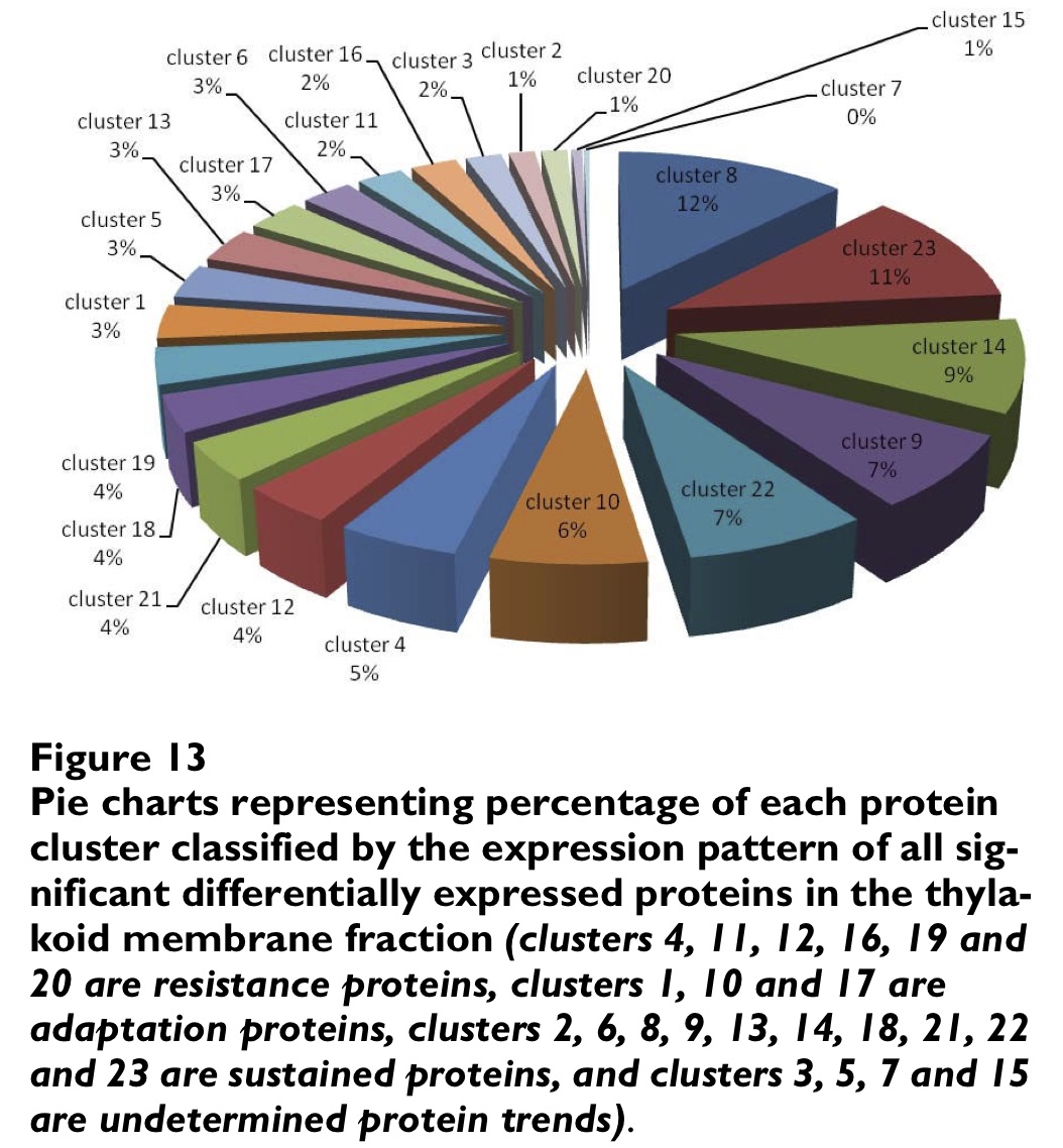
From Proteome Science (IF > 4)
There are two serious problems with this fancy 3D pie chart.
- The visual representation of the same quantity varies with the view angle. For instance, the cluster 15 (1%) seems to be much smaller than the same 1% representing cluster 20.
- Too much superfluous decoration. As per Tufte’s rigor (elaborate), it contains unnecessary decoration including the 3D shapes and colors. This is because the graph represents only one variable, namely, the percentage of each protein cluster classified by the expression pattern, while each visualization element should represent one piece of information.