In her book, Story telling with data, Cole Nussbaumer Knaflic states
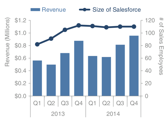
Sometimes it’s useful to be able to plot data that is in entirely different units against the same x‐axis. This often gives rise to the secondary y‐axis: another vertical axis on the right‐hand side of the graph. When interpreting Fig. 1, it takes some time and reading to understand which data should be read against which axis. Because of this, you should avoid the use of a secondary or right‐hand y‐axis.

Fig. 1: A plot with a secondary y-axis
Also, according to Stephen Few
it is inappropriate to use more than one quantitative scale on a single axis, because, to some degree, this encourages people to compare magnitudes of values between them, but this is meaningless.
There are two ways to rescue:
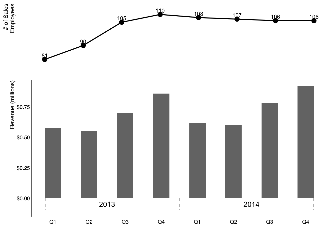
- Don’t show the second y‐axis. Instead, label the data points that belong on this axis directly.
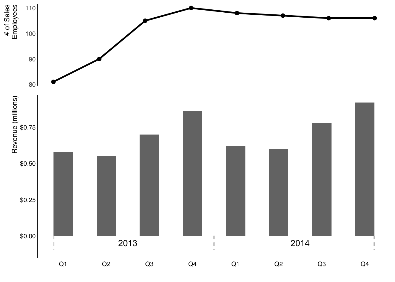
- Pull the graphs apart vertically and have a separate y‐axisforeach (both along the left) but leverage the same x‐axis across both.

Or, we can directly label the line plot.

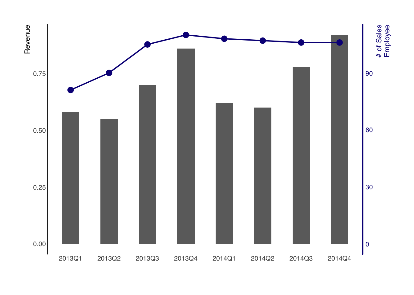
It is possible to add an indepedent second axis using ggplot, though Hadley Wickham discourages this.

Probably, you can also use facet to create two separate plots for the variables of interest.